
In the previous two posts over the weekend, you caught a glimpse of the Los Angeles Kings' new third jerseys in action and a slightly blurry but still representative image of the Tampa Bay Lightning's new "BOLTS" sweaters. Both jerseys, and especially Tampa's, look better in motion than they do in still images. Let's hope, for their sake, the same goes for the Phoenix Coyotes.


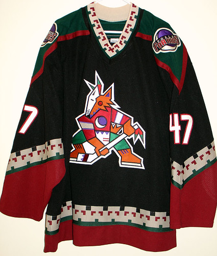
The team's first season in Phoenix saw it wear black jerseys, with that psychedelic coyote on the front. They wore variations of those sweaters until 2003-04, when the Yotes switched over to the jerseys you see on the right.
In a way, these third jerseys are a combination of the two: Black base with a more traditional representation of the mascot than the electric peyote experiment that they used to wear.
Is the logo an improvement? Perhaps. There's something to be said for the inherent motion of the new coyote compared to the regular logo, which always appeared to be ready to swallow ... something.
Chris from Icethetics had a strong opinion about the uniform as a whole:
Sports


Now if you want my opinion, here it is. I'm a little disappointed. I think I had the most hope for the Coyotes' third jersey when I first saw the logo when it leaked several months ago. I'm not a fan of the red area on the sleeve or the striping down the sides.
It's certainly a completely different look from their home and road uniforms but I'm not sure that's such a good thing in this case. I don't mind the red helmets, but they do seem a little out of place with the black jerseys.
Does the helmet bug you? Are the red sleeves and gloves veering into Hellboy territory? Is this thing an upgrade? With those questions in mind...
Pass or Fail: The Phoenix Coyotes new third jerseys?
